

Color matching aesthetics┃Use the color wheel to master the four key points of color matching in clothing
How can you stand out at first glance and show your fashion attitude by matching colors? Now follow the SO Aesthetics fashion class to explore the mysteries of the world of colors and use colors to connect all the items on your body.

Colorful colors surround us, not only enriching our daily lives, but also reflecting people's emotions and fashion trends. If you want to match the colors of your clothes well, you must first understand the color wheel. According to the color wheel, you can match the colors accordingly and simply choose the color you need, so that you can also be dazzling in a second! Highlight your personality!
💖The basic concept of the three elements of color
To understand the aesthetics of color matching, you must first understand the three major elements of color: hue, brightness and saturation.
💖Hue
Hue is the basis of color, referring to the type of color, such as red, yellow, and blue are the basis of all colors, and other mixed colors are auxiliary colors, such as red and blue mixed into purple.
💖Brightness
Brightness describes the brightness of the color, the highest brightness is white, and the lowest is black. Bright colors give people a sense of lightness, while dark colors appear stable.
💖Chroma
Chroma is the brightness of the color, and high saturation colors are more vivid. Understanding saturation will make you more aware of who is the protagonist and supporting role in color matching, and it is easier to wear a sense of hierarchy.
The interaction of these three elements affects the effect of dressing, and understanding their principles will help to better choose and match clothes.
💖Four rules for clothing color matching
In color matching, there are four major rules that are worth our in-depth study: similar colors, contrasting colors, three colors, and print + one color in the print.
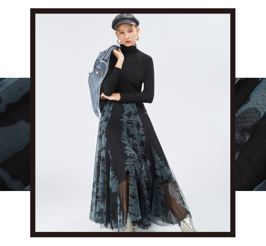
💖Color matching rule 1: Similar colors
Similar color matching refers to choosing colors with similar hues for matching, that is, using different changes in brightness and chroma, and using different shades of the same color to create a soft sense of hierarchy.
The basic color combination for beginners is to use the same color scheme. For the first time, you can start with neutral colors such as black, white and gray, and choose different shades of color to match the whole body, or choose a set of items that are easy to wear. This can simply show your aura and increase the overall sense, and also create a visual effect of lengthening your body outline.
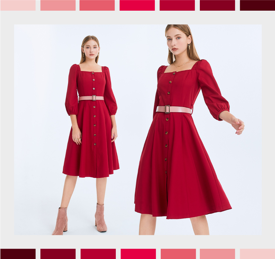
If you want to try bold and bright colors, you can choose a one-piece dress and use shoes and belts to add the same color embellishments. While emphasizing the curves of your body, even without the contrast of color blocks and lines, you can easily stand out from the crowd and create a comfortable and tasteful outfit.
💖Color matching rule 2: Contrasting colors
Contrasting colors are colors that are opposite in hue but complement each other, creating a strong visual contrast. If you want a low-key contrast, you can choose colors with high brightness and low chroma to match your outfit.

The second matching rule is the common contrasting colors, which are colors that are 180 degrees opposite to each other on the hue wheel, such as orange x blue, red x green, etc. The matching of contrasting colors can make the two more vivid and can also highlight the main items in the outfit. If you want to play with colors in a low-key way, you can choose the matching of "high brightness x low saturation", or match it with lower body and outerwear with higher depth, which will appear more delicate and worth pondering.
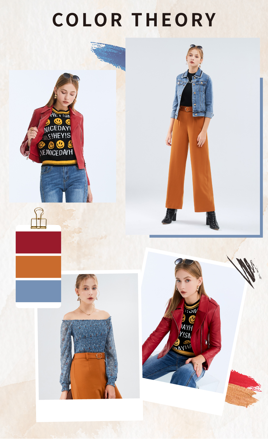
💖Color matching rule 3: Triangular relationship colors
Triangular relationship color matching refers to choosing three colors 120 degrees apart on the color wheel to match and create a lively and bright effect.

The best color matching principle is not to wear more than three colors on your body. At this time, you can use triangular relationship colors for matching. Choose corresponding colors in an equilateral triangle on the color wheel, such as the basic red, blue, and yellow elements. Through 3:7 ratio color matching and embellishment colors for integration, the visual will not be complicated or gaudy, and the proportions of the outfit will not be confused. It is a dressing template that can show fashionable taste!
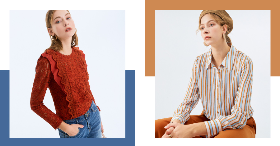
💖Color matching rule 4: Print + one color in the print

Want to try a new style, but are you worried about wearing too much? Here’s how to wear prints in your own style!
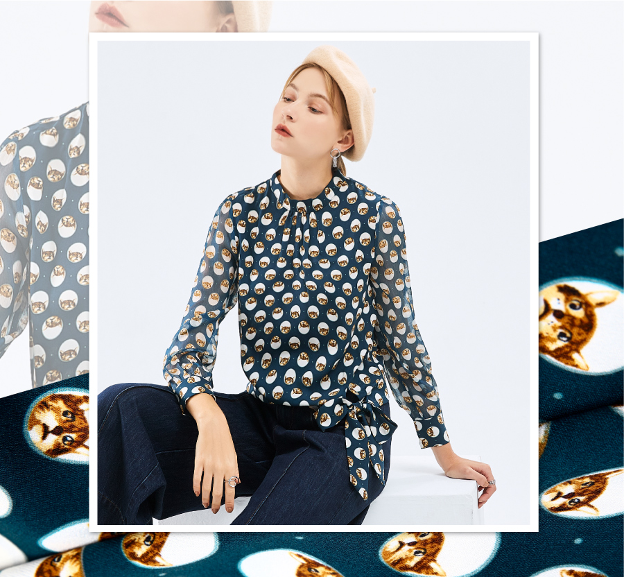
Complex and diverse printed totems are the items that best reflect your personality, and they are also the most difficult styles to master. It is recommended to start with the easy-to-use partial prints, and extract color elements from the prints for matching, and use the colors to echo the upper and lower body items. According to the different choices of prints, you can show your creativity, sometimes elegant, sometimes individual, showing a variety of looks, so that your outfit can show your personal style.
Wearing the right colors can help shape your personal image and make the overall vision more harmonious. So have you learned the above color matching rules? Next time, try to make simple matches from the items in your wardrobe to create a different mix-and-match style from usual and show a new color taste!
💖Basic clothing color matching suggestions
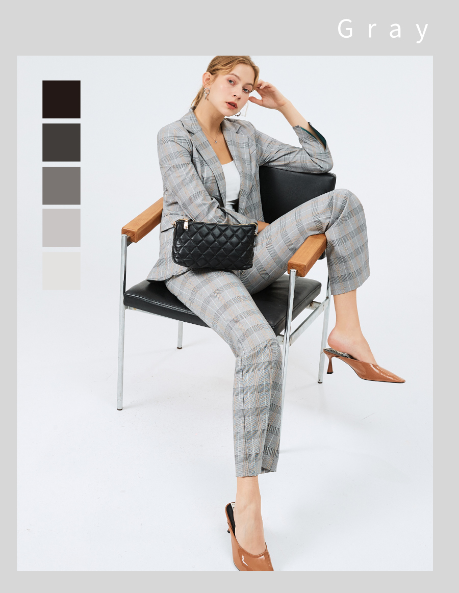
For beginners of color matching, it is recommended to start with basic color matching. Black, white, gray and skin color are the most basic colors for matching. They are easy to match and suitable for various occasions and styles. For example, a black suit with a white shirt and a gray tie is elegant and tasteful. In addition, neutral colors such as beige and khaki are also very practical basic colors. They can be used as primary or secondary colors and matched with other colors to create a stable and generous effect.
💖Clothing color matching template
In daily life, the classic black, white and gray combination is simple and fashionable, yet dignified and elegant, or the earth-tone matching is natural and fresh.

In addition, you can also try some bold color combinations, such as red and pink, to show vitality and enthusiasm.

Each template is a reflection of a style. Through reference and learning, we can find a dressing style that suits us and explore and innovate on this basis.